The dashboards and decision-support tools listed below are updated monthly, except those that are retired.
Dashboards provide information about COVID-19 vaccination coverage and adverse outcomes across Georgia counties, highlighting health equity considerations such as health disparities by race and ethnicity. Decision-support tools allow users to simulate various settings of interest and evaluate the impact of interventions.
We are immensely grateful to the users and our collaborators who provided suggestions for making the dashboards and decision-support tools more informative, addressing the needs of the public and the decision-makers.
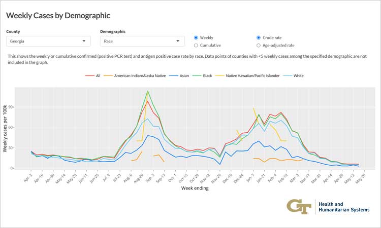
COVID-19 Trends Dashboard (by Demographic in Georgia Counties)
Shows crude and age-adjusted COVID-19 case, hospitalization, and death rates at the state and county level stratified by race, ethnicity, and age group highlighting disparities in outcomes.
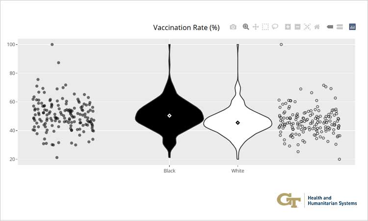
Georgia COVID-19 Vaccine Equity Dashboard
Shows COVID-19 vaccination rates by race, highlighting differences by race across counties in Georgia.
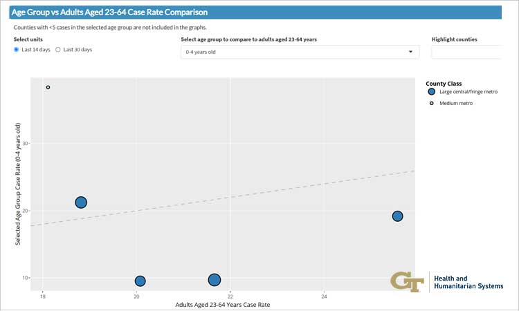
Georgia School Aged COVID-19 Dashboard
This dashboard uses Georgia DPH COVID-19 surveillance data to assess differences in case rates and vaccination trends at the county level among the school-aged population. Dashboards that focus on specific populations allow for improved monitoring and targeted decision-making.
Decision-support for Evaluating COVID-19 Interventions in Cruise Ship Settings (under development)
This decision support tool will simulate the spread of COVID-19 in cruise ship settings of various characteristics (e.g., size, target demographic, voyage duration) and evaluate the effectiveness of intervention strategies such as mask wearing and surveillance testing, among others. This tool can be adapted to simulate other infectious diseases and other small-scale settings.

Retired Dashboards
Since 2021, we have developed dashboards for granular reporting of COVID-19 outcomes in Georgia. The following dashboards are now retired since similar information is now available via Georgia Department of Public Health and other outlets.
Georgia Counties COVID-19 Trends Comparison Dashboard (retired)
Aggregates COVID-19-related outcomes and demographic data at the county level for easy comparison.
COVID-19 Georgia Metrics Dashboard (retired)
Summarizes COVID-19 prevalence in Georgia in terms of detected cases, hospitalizations, deaths, and positivity rates. It also provides risk analysis for getting infected based on age or race.
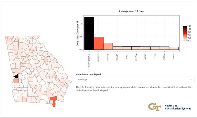
Interactive COVID-19 Ranking of Counties in Georgia Dashboard (retired)
Summarizes new daily COVID-19 cases (incidences) by county in the state of Georgia and provides an analysis for identifying counties which may be potential hot spots.